
Good navigation is essential
Navigation is a highly important tool when browsing websites. Users need to be able to easily access the content they’re looking for, without becoming confused or frustrated.
Imagine standing in a library where none of the shelves are sorted, and all of the book covers are blank, with no title or author shown. Finding the book you’re looking for would be almost impossible. A website without good menu navigation is like this library. Users will get frustrated that they can’t find the content they’re looking for, and quickly drop off the website.
We hear the phrase “content is king” all the time. But what’s just as important is helping users to discover that content. A good website has navigation that works for the user, so that finding content is simple and straightforward.
Trends in Menu Design
Like all areas of website design, menu design has evolved a lot since the days of the early web. Whilst more simple and traditional menu styles are still in use, designers are also being more creative and taking risks in 2024.
We’ve rounded up some interesting examples to show what’s possible in modern navigation design.
Horizontal Navigation
Horizontal menu bars remain one of the most common and popular navigation styles. Each top-level menu item is displayed right at the top of the page, meaning users can see key areas of the website at a glance. This style works for both simple and complex site structures, as further pages can be shown in a dropdown menu.
Maluka has a quirky website full of personality, but they keep the menu design simple. Each page is displayed in a horizontal navigation bar, with the active page underlined to show users where they are. For a site with very few pages, this basic layout works well.

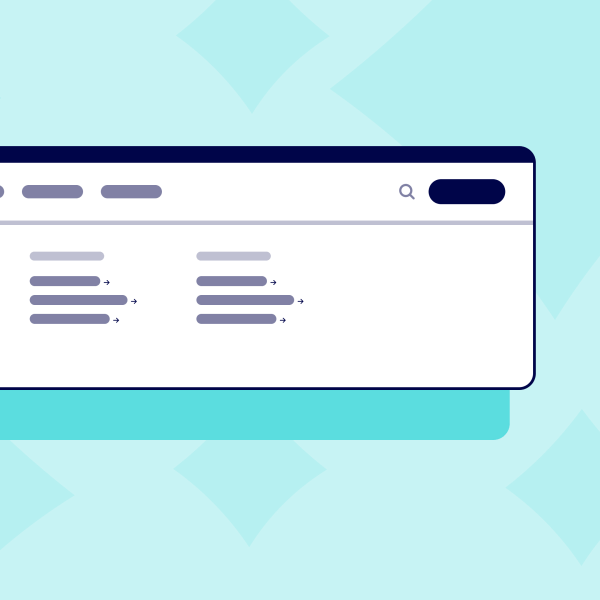
Good Books is a website with modern design flourishes such as visible grid lines and Gaussian blur. The horizontal navigation bar uses lowercase links, giving an informal, friendly tone to the site.
Despite this playfulness, the useability of the menu has also been carefully considered. Links for “books” and “people” use chevron arrows to indicate there is more content to discover within each category. Thumbnail images appear in the dropdown menu, pairing visuals with text so that items are easier to scan and differentiate.

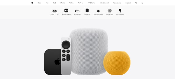
Apple has a complex website with lots of pages. Their solution is to display secondary menu items on hover. Important links are displayed in a larger font size to give them more prominence, and link items are grouped into categories.
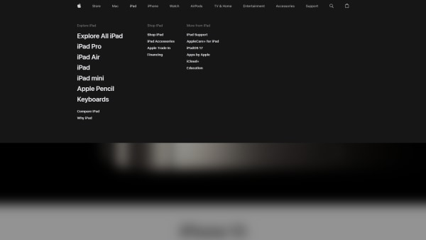
On top-level pages, Apple displays a unique secondary navigation menu. Each link is paired with an icon, so users can scan quickly and find what they’re looking for. This highly visual menu style might not work for every website, but for a product-focused one like Apple, these bespoke icons are a lovely way to direct users to relevant pages.
Vertical Navigation
For sites with fewer pages or navigation items, a vertical menu can be a great option.
The benefit of a vertical menu is that it works well responsively, meaning the menu design does not need to be adapted for smaller screens.
Octopus Energy uses a simple vertical menu that opens across the whole screen. The menu design is straightforward, because energy customers are seeking to gain information quickly and easily. However, there are still some considered design touches. A small amount of transparency behind the menu gives context to which page you’re currently on. Key links are placed at the top of the list in a larger font size, with smaller links sitting underneath. This simple visual hierarchy makes the list of items easier to digest.

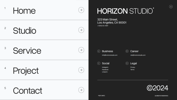
Horizon Studio is an architecture firm that also uses a full-screen vertical menu for its website. Compared to Octopus Energy, this website has a completely different audience, one that is looking for creativity and sleek design. Horizon Studio has more scope to be playful, which they do using sliding animations, a bold black-and-white layout, and large text. Yet the menu is still highly functional, displaying navigation items on the left and useful contact information on the right.
Experimental Menu Design
Not all websites use navigation designs that are led solely by function. Sometimes, the experience of interacting with the website can be just as important as making users stop and take note. Standing out from the crowd can create a lasting impression. Of course, the menu still has to be practical and functional, so finding the right balance is important.
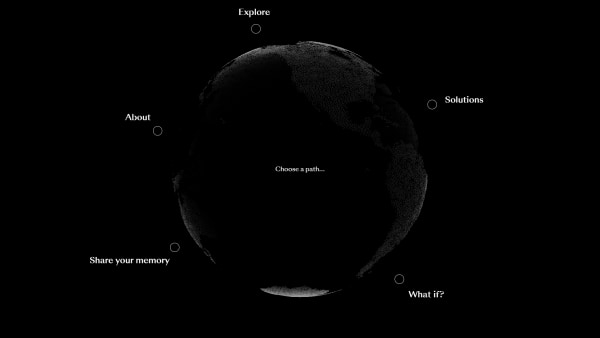
What is missing? is a website about the environment and sustainability. The menu design is highly creative, with each primary navigation link circling a slowly spinning globe. Although a circular navigation might be unfamiliar to many users, subtle cues such as “choose a path” text or rollover states make it clearer that the text items are links. When hovering, a background image fills the central space, and descriptive text gives a preview of the content in that section. This is a lovely example of creativity and functionality coming together to create a unique user experience.
Conclusion
Navigation menus can be as crazy or tame as you desire. With all sorts of creative leaps and bounds in recent years, website design is truly limitless in terms of what you can create.
There is no one-size-fits-all navigation solution. The important takeaway is that your menu design should always be tailored to suit the unique needs of your website, with a deep understanding of user behaviour.
At tda! we are experts in user experience design. We’d love to help perfect your website’s navigation - get in touch today.


